Icon

General discussion and chat (archived)
Supernova

Re: Icon

Unread post by Supernova » 2014-11-19, 14:47

Moonchild wrote:(I would rather call them glyphs instead)
Guess what, I thought about something similar.
Drawing => Glyph => Alphabet => Glyph again ???

TELVM

Re: Icon

Unread post by TELVM » 2014-11-19, 15:51

Three epic excerpts from lucid people's comments to the article linked by Testertime:
... These bright, Kandee-Kolored Klown interfaces seem to me to be built to appeal to 4-year-olds, not adult eyes and sensibilities, and I hope at some point we go back to more sophisticated, information-dense interfaces ...
... I’d like to know who could possibly find this design an improvement, or tolerable, other than the designers jerking off over them ...
... Flat design is like a plague, a virus of conformity, killing usability in the name of fashion and profit ...

User avatar
bawldiggle
Lunatic
Lunatic
Posts: 446
Joined: 2013-02-22, 21:16
Location: East Coast Australia

Re: Icon

Unread post by bawldiggle » 2014-11-21, 14:05

Some web-pages have gone "flat" ... trying to identify active controls from 'arty embellishments drives me knutts ? :twisted:
I don't want to have to poke around the screen ... like poking road kill to see if it is alive!

Palemoon works. It is it not trying to be "like" something else otherwise we would be all bemoaning Australis. :think: :wtf:
- I see PM as being the leader not a follower

I dont have time for navel gazing. I have to be out there selling my service rather than agonizing over the corporate "wallpaper" !

-- if it aint broke don't fix it.
Win-7 PRO 64-bit
Palemoon; auto updates current version (32-bit)

ben557

Re: Icon

Unread post by ben557 » 2014-12-08, 01:48

Crap. I thought this was posted to the FOSSA mail development subforum, wasn't it? Well damn. I meant the FOSSA mail icon.


9 pages. This topic is the worst subform misclick I've ever seen from anyone -- and I've rarely made these mistakes myself!
Off-topic:
So.
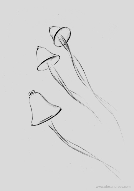
I like these bells:

Image

The lowest bell from this picture looks groovy. I like how the bell's square tie-knob looks in this sketch style.

A bell might work for a mail application if you ever want to change the FOSSA mail icon.

User avatar
Moonchild
Pale Moon guru
Pale Moon guru
Posts: 35648
Joined: 2011-08-28, 17:27
Location: Motala, SE

Re: Icon

Unread post by Moonchild » 2014-12-08, 23:33

Off-topic:
I thought this was posted to the FOSSA mail development subforum, wasn't it? Well damn. I meant the FOSSA mail icon.
:P
The icon is a commissioned picture of a Fossa. As in, the animal.
What do bells have to do with a Fossa?

Since this thread got a life of its own about the Pale Moon icon, this is now off-topic ;)
so... please make a new thread in the FossaMail subforum.
"Sometimes, the best way to get what you want is to be a good person." -- Louis Rossmann
"Seek wisdom, not knowledge. Knowledge is of the past; wisdom is of the future." -- Native American proverb
"Linux makes everything difficult." -- Lyceus Anubite

ben557

Re: Icon

Unread post by ben557 » 2014-12-09, 22:47

Anyway, nevermind. I never knew 'Fossa' was an animal. I thought FOSSA had something to do with 'FLOSS'
I guess you better keep it as a cougar weiner dog. :eh:

User avatar
Moonchild
Pale Moon guru
Pale Moon guru
Posts: 35648
Joined: 2011-08-28, 17:27
Location: Motala, SE

Re: Icon

Unread post by Moonchild » 2014-12-09, 22:54

Off-topic:
ben557 wrote:Anyway, nevermind. I never knew 'Fossa' was an animal. I thought FOSSA had something to do with 'FLOSS'
I guess you better keep it as a cougar weiner dog. :eh:
It's both a play on the animal and on FOSS as the software concept.
"Sometimes, the best way to get what you want is to be a good person." -- Louis Rossmann
"Seek wisdom, not knowledge. Knowledge is of the past; wisdom is of the future." -- Native American proverb
"Linux makes everything difficult." -- Lyceus Anubite