Page 19 of 21
Re: What my Pale Moon looks like
Posted: 2017-11-22, 01:36
by loxodont
Preparing for Basilisk ...

Re: What my Pale Moon looks like
Posted: 2017-12-06, 11:12
by ShonkaiDJ
My Digital mid term memory.....backed up by Febe....Since 2009
(No need to tell why Palemoon is my No1. Moonchild...)
Re: What my Pale Moon looks like
Posted: 2017-12-16, 03:32
by doofy
Minimalism:

Re: What my Pale Moon looks like
Posted: 2017-12-18, 16:10
by JoeyG

Full-size image:
http://www.edu-net.net/images/PMandBasilisk.jpg
(Please: How can I add a link "in my image" so it becomes clickable to view the full-size image? Thanks.)
Re: What my Pale Moon looks like
Posted: 2017-12-19, 08:15
by fatboy
Here it is! Looking mighty fine!
Re: What my Pale Moon looks like
Posted: 2017-12-19, 12:36
by Night Wing
Every few months I like to change things in Pale Moon for a different look. Below is a screenshot of my 64 bit linux Pale Moon 27.6.2 running in the just released 64 bit Linux Mint 18.3 (Sylvia) Xfce distro.
With Mint, you can change some aspects in Pale Moon. My Title Bar is a window manager style theme named, "Daloa", which gives the title bar a color. The Window Manager works in conjunction with Appearance. The style theme under Appearance is named, "xfce-redmondxp" and this controls the color of my Mint Panel (taskbar for those using Windows) as well as the number of Bookmarks I can have in the Bookmarks Toolbar. It also allows the blue color of the title bar.
Still under Appearance, the icon which controls the color of the folders in Pale Moon's Bookmarks Toolbar which gives my folders a blue color is named, "Mint-X-Blue". Finally, the skin of my linux Pale Moon is a lightweight persona/theme named, "Blue Light 2012".
All of the customization you're are seeing in my Pale Moon was created with the Customization window which lets me have two toolbars instead of three toolbars. Two toolbars gives me a little more vertical viewing space. It also allows to move my buttons to where I want them. Ditto for the Navigation Bar. Since I never use the Search Bar, I removed it. There is no customized coding either for what you are seeing. You'll have to left click on the attachment to enlarge it.
Re: What my Pale Moon looks like
Posted: 2017-12-26, 02:13
by FranklinDM
Working on a new theme that looks like MS Edge, mostly incomplete but the tab + toolbar images are already in place.
Re: What my Pale Moon looks like
Posted: 2018-01-15, 00:17
by tony-aln

Pale Moon 27.6Desktop Environment: KDE Plasma v5.11.5, OS: GNU/Linux; Distribution: Arch Linux
To see how it fits in the desktop, here's the link to the gallery for more:
https://postimg.org/gallery/16p5jqa4g/
It has been this way for several months or more, it's so neutral that I may have set this back in 2016 and I wouldn't have noticed, I have organized the window decoration to have it's buttons on the left side of the screen, as well as the window title.
On my desktop (pictures on the aforementioned gallery) I have two panels, organized in a way that the panel with the taskbar goes behind the window when the application is active (or maximized), just waiting for a mouse hover on the first column of pixels where it is at to be visible again and on the top right of the screen, the panel with the status bar, notifications drawer, clock and other useful stuff is, free to be on top of any application's title bar decorations (pretty much all of them to me). That helps to save 20 pixels of real estate on the y axis at any time, and 40 on the x axis when any application is maximized, and it has my personal preference baked in.
The typeface used on Pale Moon User Interface is called Ubuntu (by the Ubuntu distro folks).
The icon set is called Breeze, it doesn't apply to the extensions' icons and some icons that Pale Moon uses.
The theme (persona) is called "I like the gray", by tahomadesign. I matched my desktop's color scheme to this gray, to be as seamless as possible and incurring less eye strain.
Thanks to this post, I'm going to see if I need all those extension icons there yet, since I haven't been using some of them.
Re: What my Pale Moon looks like
Posted: 2018-01-15, 01:02
by Moonraker
I like the dark look as im in my mid 40s and my eyes become a bit more sensitive to light themes.

Re: What my Pale Moon looks like
Posted: 2018-01-15, 01:19
by tony-aln
Moonraker wrote:Screenshot_2018-01-15_00-59-19.png
I like the dark look as im in my mid 40s and my eyes become a bit more sensitive to light themes.
XFCE, cool! About the light themes, I agree. I forgot to tell that my theme color was also chosen to be nice in the eyes with the colors normal or inverted.
Take a look at freetype and harfbuzz, they have grown so much recently and freetype has a new anti aliasing code that use subpixel rendering like ClearType on Windows wich will make the fonts on your monitor look more easy on the eyes and sharper, independent on the background color.
Edit: I messed the previous one a little.
Re: What my Pale Moon looks like
Posted: 2018-01-25, 15:45
by EMH_Mark_I
A lot of XFCE guys here, neat!
Re: What my Pale Moon looks like
Posted: 2018-02-07, 01:34
by Moonraker
Finally got walnutty2 installed.Beautiful wood theme.
XFCE is the best linux DE IMHO.

Re: What my Pale Moon looks like
Posted: 2018-02-07, 11:57
by MoonMadness
FranklinDM wrote:Working on a new theme that looks like MS Edge, mostly incomplete but the tab + toolbar images are already in place.
Captureii.PNG
I really like that. Very simple. I guess it's not yet available for download is it?
Re: What my Pale Moon looks like
Posted: 2018-02-13, 21:14
by Moonraker
Nauticula theme.Wonderful thought this was gone forever.
Only Pale moon can give you this beautiful customisation.
Re: What my Pale Moon looks like
Posted: 2018-02-14, 15:48
by Night Wing
I changed the skin color of my 64 bit linux (and for that matter, 32 bit windows also) Pale Moon 27.7.2 running in 64 bit linux Mint 18.3 (Sylvia) Xfce from the lightweight theme/persona Blue Light 2012 to Fuzzy Navel. Fuzzy Navel is similar to the lightweight theme/persona named Caramel, but Caramel has a hint of black color which is imparted to the Bookmarks Toolbar. Fuzzy Navel does not have the hint of black color. Fuzzy Navel will also color the Status Bar too.
Below is the attachment and you'll have to left click on it to enlarge it.
Re: What my Pale Moon looks like
Posted: 2018-02-14, 22:05
by Moonraker
Very nice looking there night wing.Xfce is the best desktop IMHO.

Re: What my Pale Moon looks like
Posted: 2018-02-15, 06:36
by hobbledehoy899
I know this isn't my entire Pale Moon, but this is what my tabs look like.

It took three separate extensions for them all to look this way; Color My Tabs, Tab Mix Plus, and Thin Tabs.
Off-topic:
Why yes, I do take really good screenshots; Color My Tabs' active tab colored indication bar is actually only four pixels thick.
Re: What my Pale Moon looks like
Posted: 2018-03-22, 09:36
by SpockFan02
I've had this theme for a few months, and have been using it as my main theme for about a week. Mozilla's fire is animated, and can be directed at Internet Explorer.
I change the color scheme occasionally. The tabs are usually wider; I was just testing something with userChrome, but that's what they authentically looked like at the time the screenshot was taken.
Re: What my Pale Moon looks like
Posted: 2018-04-15, 13:02
by Sampei Nihira
Re: What my Pale Moon looks like
Posted: 2018-04-18, 19:09
by fatboy
Sampei Nihira wrote: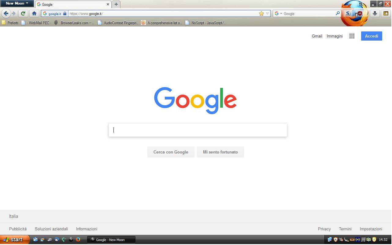
Are you running Windows XP? Or is it a badass LXDE theme?